
That a website is compatible with mobile devices, mobile friendly or responsive means that it can not only be viewed and navigated correctly on a computer but also on all types of devices such as, for example, tablets, PDA’s, mobile phones… etc.
Today this point is more important than ever since a large part of web and public traffic comes from mobile devices.
Benefits of responsive design and mobile web compatibility
The benefits of a mobile friendly or responsive website are the following:
- At the level of SEO improvements, it must be taken into account that Google penalizes sites that are not compatible with mobile devices or have some problem in this regard. Therefore, if what we want is to improve web positioning, it is convenient for us to make our website mobile friendly.
- The user experience is much better if the website is mobile compatible.
Let’s think for a moment about this point… What happens when a user visits a website that is not compatible with mobile phones?
Basically, the user will encounter a series of difficulties when reading and navigating through the information and, unless the information they are looking for is very specific and not found elsewhere, they will leave the page in a very short time, looking for a better alternative.
This means that a mobile friendly website will increase the time that users spend on said website, again improving its SEO. - More and better traffic. This point follows from the previous two. On the one hand, if Google does not penalize us we will be in a better position in the search results which leads to more traffic and, on the other hand, if the user experience is better they will stay on our website longer, giving rise to the fact that the traffic we have is of higher quality.
Manual mobile web compatibility test
One of the ways to check if your website is mobile compatible is manually, think as if you were a user and ask yourself… Can I see it correctly? Is it easy to navigate through the menu? Are the fonts and links big enough? What parts would I improve?… etc.
Keep in mind that this technique is quite superficial and you should complement it with an automatic mobile compatibility check. However, this is the first step to take. You should not perform an automatic check until you fix any bugs or improvements found in this phase.
There are basically two ways to check the mobile compatibility of a website manually:
- Use a specific mobile device, that is, visit the website in question with your mobile phone or tablet.
- Simulate the mobile view through our browser without having to use other devices. This last option allows you to check out a wider range of resolutions, devices and options that we would not otherwise be able to achieve.
Mobile web compatibility with Firefox
To access the mobile view from Firefox, we will right-click on the website and select the “Inspect element” option. An alternative is to press “Ctrl+Shift+K”.
After that, you should look for the icon of a mobile/tablet that has the label “Responsive Design View”. An alternative is to press “Ctrl+Shift+M”.
The website will appear in a small box. We can configure multiple options such as the resolution, screen orientation and connection used by the mobile device:
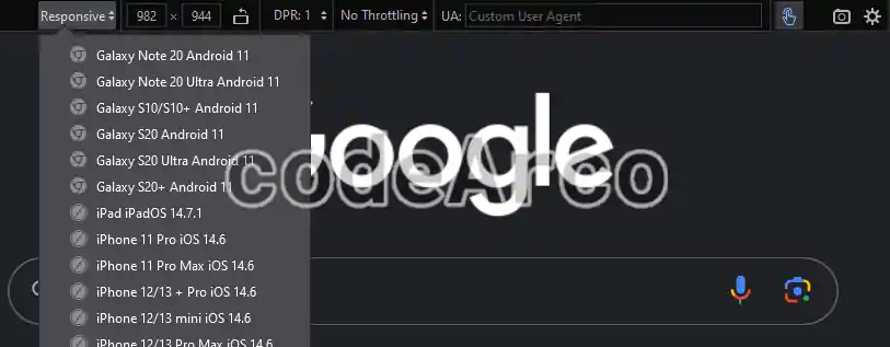
Additionally, through the gear button, we can configure more options such as aligning the viewport to the left or showing and editing the agent used by the user.
Mobile friendly with Chrome
To access the mobile view from Chrome the steps are very similar to Firefox. We will click with the right mouse button on the page and click on “Inspect”. An alternative is to press “Ctrl+Shift+I”.
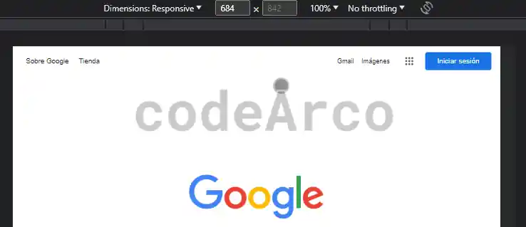
Then, at the bottom or right we will look for the mobile/tablet icon that is labeled “Toggle device Toolbar”.
The website will appear minimized. We can also configure multiple options such as screen resolution, device or zoom percentage.
Additionally, through the three dots in the upper right, we can configure other options such as showing or hiding media queries, showing the rules or making a screenshot.
Mobile friendly test with automatic tools
After having manually checked whether a website is responsive or not, we will automatically check if a website is compatible with mobile devices. This way is much more complete since it is carried out by a machine and not a human being and, therefore, it can detect errors that we may have missed. However, the opposite can also happen, that is, the analyzed page passes the automatic tests but at the mobile usability level it can be improved.
As we have already mentioned, you should only perform this step once you have solved the errors and improvements derived from the manual inspection of the website.
Mobile friendly with Google Search Console
As of today, the Google Search Console mobile friendly tool is retired and, therefore, is not a viable alternative since it cannot be use.
Basically it consisted of a series of reports and recommendations aimed at the mobile optimization of a website, however, we keep this section in the article in case there are any clueless people who still believe that it still exists.
Mobile web optimization with Google PageSpeed Insight
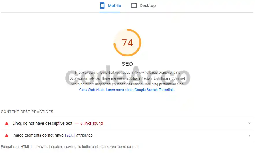
The mobile friendly alternative to Search Console is Google PageSpeed Insights. As we have seen previously, it is a very useful tool when it comes to improving web speed on both mobile devices and computers. It is made up of four sections with errors, improvements and warnings about the performance on all types of devices:
- Performance, points related to the times relative to the different metrics.
- Accessibility, that is, everything that has to do with making our website easily accessible to all types of audiences such as, for example, people with cognitive difficulties.
- SEO recommendations and tips, as its name suggests, list of errors and warnings that can affect our SEO positioning. It is in this section where we will find the mobile friendly errors since they are the ones that can lead to some SEO penalty.
- Recommended practices and tips, is basically a set of warnings and errors that are not categorized in the previous sections.
Some PageSpeed Insights mobile compatibility errors, which we will find within the SEO section, are:
- It does not have a <meta name=”viewport”> tag with width or initial-scale. This tag optimizes a website for screen sizes on mobile devices.
- The document does not use legible font sizes. Text cannot be read correctly on mobile devices because there are no viewport meta tags.
- The size of the touch elements is not adequate. For the same reason as the previous one, since there are no meta viewport tags optimized for mobile devices, touch elements such as buttons are difficult to use on these devices.
Mobile friendly test on Bing
Another free tool to do a mobile friendly test is the one belonging to Bing. All you have to do is enter the url of the page to analyze and click on Analyze.
Although it is a much less powerful tool than the previous one, it is capable of verifying a few points as you can see below:
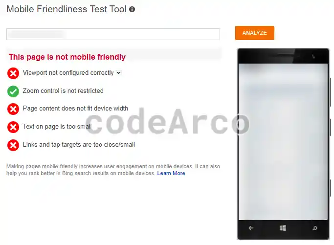
Some mobile friendly errors that we found in Bing are:
- Viewport not configured correctly. As before, viewport meta tags are missing.
- The page content does not fit within the width of the device. This is because you cannot comfortably scroll horizontally.
- The text on the page is too small, as before, it is necessary to use some system that allows the text to adapt to small screens.
- Links and objects to click are too small or too close. Again, as before, without meta viewport tags, touch elements such as links or buttons are difficult to use.
How to make a responsive website for mobile
We will not go into many details about how to get a website compatible with mobile devices since it is a complex topic and requires technical knowledge, especially frontend, however, we are going to see a few recommendations.
If you use a content manager or are considering which CMS is best for your website, here is an important point: the CMS must provide some media and/or template compatible with mobile devices. For example, one of the criteria for choosing a WordPress template is that it is mobile friendly.
If, on the other hand, you do not use a content manager, but rather have a custom-made website or a static web page, you can use a mobile friendly design framework such as Bootstrap.
Remember that you should not stay only in the most superficial and visual part. As we already mentioned, for these devices, given that they are less powerful than a computer, it is necessary to analyze and improve the loading speed of the website for which you can, for example, reduce the weight of images, optimize multimedia elements such as videos using the code snippets provided by platforms such as YouTube or work on the backend reducing loading times.
In conclusion, if you are looking to improve your SEO positioning, check that your website is compatible and optimized for mobile devices.